New features, new version of WarpStudio, dynamic dashboard tool… Looking back over the last 12 months for the Warp 10 Platform.
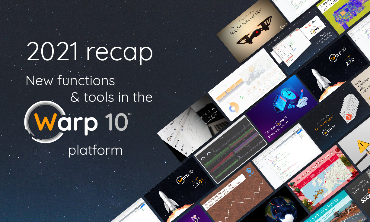
2021 is over.
First of all, the entire SenX team wishes you a happy new year 2022. May it be rich in data and full of success for your projects.
Last year, in the 2020 recap, the most important information was the Covid Pandemic. It’s sad to see that this point has not changed for 2021. But that hasn't stopped the SenX team from continuing to work on the Warp 10 platform.
This article is there to summarize the 2021 new features of the platform.
| Warp 10 is a modular open-source platform that collects, stores, and analyzes sensors and time series data. Learn more on warp10.io |
What's new?
The 2021 recap of the Warp 10 Platform in figures:
- 7 releases
- WarpLib reached 1277 available functions
- 4518 GitHub interactions
Some of the major changes:
- Interacting with Git repositories from Warp 10. Read this article to learn more.
- Crypto-related functions have been added, like the Shamir’s Secret Sharing Scheme
->SSSSandSSSS->and Elliptic-curve Diffie–HellmanECDHto share secrets. - Warp 10 now also supports KML and GML with the
->KML,->GML,GEO.KML,GEO.KML.UNIFORM,GEO.GMLandGEO.GML.UNIFORMfunctions.
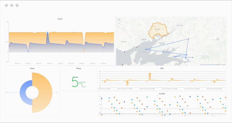
Discovery, a dynamic dashboard as code tool
With a unique dashboard as code approach, Warp 10 Discovery allows you to create highly dynamic dashboards from your time series data. This means you can now create dashboards with content that can completely change depending on the actual context.
Discovery was announced at the end of 2020 and was based upon the WarpView Web Components and a set of WarpScript macros.
But we encountered some limitations. So we decided to build a brand new Web Component library inspired by WarpView and specially designed for dynamic dashboarding.
This new library is one of our 2021 achievements.
Here are some features of Discovery:
- New charts and features
- Scatter and bubble chart, line chart, area chart, gauges, SVG display, tabular data, Nightingale's rose, pie and doughnut, image, map, display, bar chart and more
- Auto complete and list, date, slider, date range, text, buttons and secret inputs that allows you either to do some control command, or to parametrize your dashboards
- Thresholds on bar, line chart and scatter
- Tracking feature on map
- WebSocket support for better auto-refresh feature
- Add HTTP headers as an option to add custom headers to the exec request
- PNG export
- Allow axis hiding
- Allow time/value boxing on axis
- Custom styles for tiles and color schemes
- Multi axis (Y and/or X)
- Dynamic dashboards
- Dashboard based upon a customizable grid
- Scada-like dashboard that allows you to put tiles with x, y and z.
- MacroTiles -> Dynamic tiles definition in dashboards through a macro.
- Custom styles for dashboards
- Event mechanism
- Audio, popup, var, xpath, style and more
- Zoom / Focus sync between charts
- Native support in WarpStudio thanks to a new Discovery macro set
Many more are planned for 2022.
WarpView will be deprecated later this year.
Want to create your own dynamic dashboard? You can follow the step-by-step tutorial on the Warp 10 documentation, or read these three tutorials on the blog:
- Server monitoring with Warp 10 and Telegraf
- Covid Tracker built with Warp 10 and Discovery
- Santa asset tracking and delivery service
A new version for WarpStudio
For the new ones who might not know, WarpStudio is a Web IDE dedicated to Warp 10, either online or on-premise. It allows you to edit your code (WarpScript or FLoWS), execute your scripts on a specific instance, and visualize the results thanks to dataviz capabilities.
The tool was launched in July 2019, and in June 2021, a new version was released, offering new features and improvements.
Among the major novelties of WarpStudio 2, there are:
- A Console tab to centralize and keep track of your executions
- Choose the kind of visualization you want
- Display a Discovery Dashboard
- Add remote GIT repositories to save scripts remotely
- Find the documentation directly in WarpStudio
- The use of Private Network Access (CORS-RFC1918) with WarpStudio is now possible (with still some restrictions). Read the blog post to learn more about it.
And more.

The full and detailed list of new features and improvements of WarpStudio is here.
2021, 3rd year for the SenX blog
This year again, 44 new articles have enriched the blog, which means that there are almost 170 blog posts to learn more about data in general and to get started with Warp 10, and become an expert.
Here are the top 3 of 2021 articles picked by the SenX team:
- Warp 10 and the WarpScript/FLoWS dev in your CI/CD pipeline
- Alerts are real time series
- All about the Geo Time Series model
Takeaways
Do you work with time series or sensor data? I’m sure you will be interested in some of our new features. Warp 10 is fully open source, and you can even try it out without deploying it, thanks to the Sandbox.
Subscribe to our newsletter and follow us on Twitter to learn what 2022 holds.
And again a very Happy New Year 2022!
Read more
Server monitoring with Warp 10 and Telegraf
Thinking in WarpScript - Essential frameworks
A review of smoothing transforms in WarpLib

Digital Communication Manager