From datasets to dashboard: the full way to track Covid around the World with Warp 10. Discover the event mechanism of Discovery.
At the beginning of the Covid pandemic, a French guy (Guillaume Rozier) made a wonderful tool which aggregates data about the pandemic, it's called "Covid Tracker". I would like to salute his great job.
For now, we will try to build that kind of stunning dashboard based upon data from Our Word in Data.
The goal of this post is to build this dashboard and explore the event mechanism of Discovery:

Data upload
The first step is to generate tokens for our Sandbox in order to have a Warp 10 playground.
Go to https://sandbox.senx.io/ and click on "Enter Sandbox". Copy read, write and delete tokens.
There are many ways to fetch data from Our Word in Data and upload it into Warp 10. Here, we will use a small NodeJS script.
In a new folder called covid-dataset type:
npm init
npm install @senx/warp10 byline country-coords dayjs fs-extra iso-3166-1-codes ora@5.4.1
Create a new index.js file:
const bl = require("byline");
const fs = require('fs');
const https = require('https');
const ora = require('ora');
const dayjs = require('dayjs');
const coords = require('country-coords');
const byCountry = coords.byCountry();
const countries = require('iso-3166-1-codes');
const byAlpha3 = countries.byAlpha3();
const Warp10 = new require("@senx/warp10").Warp10;
const w10 = new Warp10('https://sandbox.senx.io');
const writeToken = 'Your write token here'; // !!!
const spinner = ora('Loading data').start();

function download(url, dest, cb) {
  const file = fs.createWriteStream(dest);
  https.get(url, function (response) {
    response.pipe(file);
    file.on('finish', function () {
      file.close(cb);  // close() is async, call cb after close completes.
    });
  }).on('error', function (err) { // Handle errors
    fs.unlink(dest); // Delete the file async. (But we don't check the result)
    if (cb) cb(err.message);
  });
}

function toDouble(x) {
  return Number.parseFloat(x).toFixed(2);
}

function parse() {
  spinner.succeed('Data downloaded');
  spinner.start('Parsing data');
  const data = [];
  const stream = bl.createStream(fs.createReadStream('data.csv', {encoding: 'utf8'}));
  stream.on('data', function (line) {
    if (!line.startsWith('iso_code') && !line.startsWith(',')) {
      const l = line.split(',');
      if (byAlpha3.has(l[0])) {
        const date = dayjs(l[3], 'YYYY-MM-DD').valueOf() * 1000;
        const country = byCountry.get(byAlpha3.get(l[0]).alpha2);
        const values = [];
        let k = 1;
        for (let j = 4; j < l.length; j++) {
          if (l[j] && '' !== l[j] && !isNaN(l[j])) {
            values.push(`${k}/${l[j]}`);
          }
          k++;
        }
        const gts = `${date}/${toDouble(country.latitude) + ':' + toDouble(country.longitude)}/ covid{continent=${encodeURIComponent(l[1])},country=${encodeURIComponent(l[2])}} [ ${values.join(' ')} ]`;
        data.push(gts);
      }
    }
  });
  stream.on("end", () => {
    fs.writeFileSync('data.gts', data.join(''));
    spinner.succeed('Parsing done');
    spinner.start('Uploading data');
    w10.update(writeToken, data).then(() => spinner.succeed('Uploaded ' + data.length)).catch(err => {
      spinner.fail('Error');
      console.error(err);
    });
  });
}

const file = fs.createWriteStream("data.csv");
download("https://covid.ourworldindata.org/data/owid-covid-data.csv", 'data.csv', parse);
I will not explain this code, but, trust me, it works ;).
Here is the CSV mapping:
// 0 iso_code
// 1 continent
// 2 location
// 3 date
// 4 total_cases
// 5 new_cases
// 6 new_cases_smoothed
// 7 total_deaths
// 8 new_deaths
// 9 new_deaths_smoothed
// 10 total_cases_per_million
// 11 new_cases_per_million
// 12 new_cases_smoothed_per_million
// 13 total_deaths_per_million
// 14 new_deaths_per_million
// 15 new_deaths_smoothed_per_million
// 16 reproduction_rate
// 17 icu_patients
// 18 icu_patients_per_million
// 19 hosp_patients
// 20 hosp_patients_per_million
// 21 weekly_icu_admissions
// 22 weekly_icu_admissions_per_million
// 23 weekly_hosp_admissions
// 24 weekly_hosp_admissions_per_million
// 25 new_tests
// 26 total_tests
// 27 total_tests_per_thousand
// 28 new_tests_per_thousand
// 29 new_tests_smoothed
// 30 new_tests_smoothed_per_thousand
// 31 positive_rate
// 32 tests_per_case
// 33 tests_units
// 34 total_vaccinations
// 35 people_vaccinated
// 36 people_fully_vaccinated
// 37 new_vaccinations
// 38 new_vaccinations_smoothed
// 39 total_vaccinations_per_hundred
// 40 people_vaccinated_per_hundred
// 41 people_fully_vaccinated_per_hundred
// 42 new_vaccinations_smoothed_per_millions
// 43 tringency_index
// 44 population
// 45 population_density
// 46 median_age
// 47 aged_65_older
// 48 aged_70_older
// 49 gdp_per_capita
// 50 extreme_poverty
// 51 cardiovasc_death_rate
// 52 diabetes_prevalence
// 53 female_smokers
// 54 male_smokers
// 55 handwashing_facilities
// 56 hospital_beds_per_thousand
// 57 life_expectancy
// 58 human_development_index
// 59 excess_mortality
All fields starting at total_cases are stored in a multi value GTS. So, the index will be shifted by four, for instance:
1585692000000000/33.00:65.00/ covid{continent=Asia,country=Afghanistan} [ 1/197.0 2/22.0 3/17.286 4/4.0 5/0.0 6/0.286 7/5.061 8/0.565 9/0.444 10/0.103 11/0.0 12/0.007 13/1.47 40/67.59 41/38928341.0 42/54.422 43/18.6 44/2.581 45/1.337 46/1803.987 48/597.029 49/9.59 52/37.746 53/0.5 54/64.83 55/0.511 ]The first value of multi-value field is total_cases.
After filling in your write token in index.js, you can run it with node index.js
First WarpScript
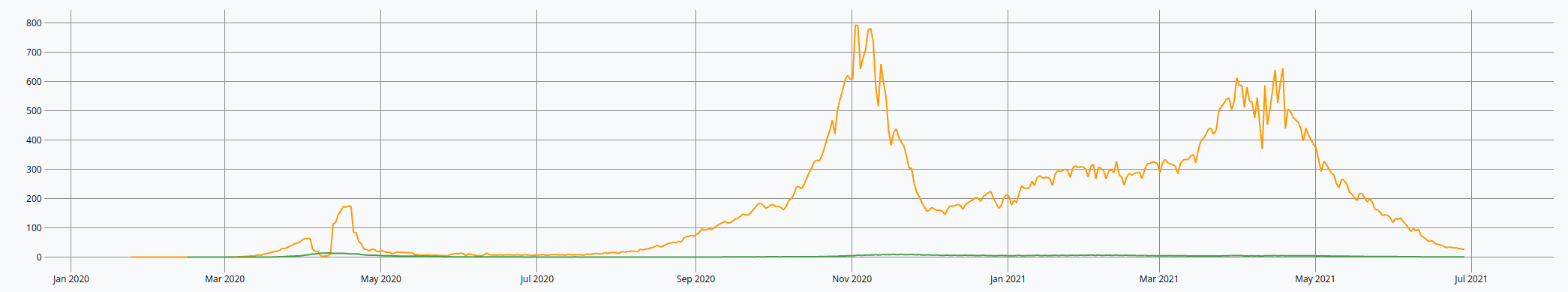
To test our data, we will display the Deaths/Cases per million for a particular country. Open WarpStudio and type:
'Your read token here' 'token' STORE
[ $token 'covid'  { 'country' 'France' }  NOW 365 d 5 * ] FETCH 'data' STORE
$data [ 8 11 ] {  8 'new_cases_per_million' 11 'new_deaths_per_million' } MVTICKSPLIT // <--- see mapping
<% ->GTS VALUELIST %> F LMAP FLATTEN 'data' STORE // extract specific fields as GTS
[ $data bucketizer.sum NOW 1 d 0 ] BUCKETIZE  'data' STORE // the daily sum
[ $data mapper.mean 7 0 0 ] MAP 'data' STORE // 7 days moving average
[ $data mapper.abs 0 0 0 ] MAP 'data' STORE // there some negative values
$data
You can find directly the code here: https://snapshot.senx.io/0005c598e412d1ed-0-5-36038d8c374f6da2
If everything is fine, let's build a dashboard.
The dashboard
We use a macro (available with the WarpFleet Resolver) called @senx/discovery2/render. It needs a dashboard definition and a map of parameters, typically here, the Warp 10 endpoint.
Open WarpStudio and bootstrap the dashboard like this:
{
    'title' 'Covid Tracker'
    'description' 'The Covid 19 dashboard'
    'tiles' [    // Tiles here
    ]
} { 'url' 'https://sandbox.senx.io/api/v0/exec' } @senx/discovery2/render
After execution, a "WebView" tab appears, click on it:
Everything is fine, it's time to define some global variables:
{
    'title' 'Covid'
    'description' 'The Covid 19 dashboard'
    'vars' {
        'token' 'Your Read Token'
        'country' 'France'
        'mapping' {
            1 'total_cases'
            2 'new_cases'
            3 'new_cases_smoothed'
            4 'total_deaths'
            5 'new_deaths'
            6 'new_deaths_smoothed'
            7 'total_cases_per_million'
            8 'new_cases_per_million'
            9 'new_cases_smoothed_per_million'
            10 'total_deaths_per_million'
            11 'new_deaths_per_million'
            12 'new_deaths_smoothed_per_million'
            13 'reproduction_rate'
            14 'icu_patients'
            15 'icu_patients_per_million'
            16 'hosp_patients'
            17 'hosp_patients_per_million'
            18 'weekly_icu_admissions'
            19 'weekly_icu_admissions_per_million'
            20 'weekly_hosp_admissions'
            21 'weekly_hosp_admissions_per_million'
            22 'new_tests'
            23 'total_tests'
            24 'total_tests_per_thousand'
            25 'new_tests_per_thousand'
            26 'new_tests_smoothed'
            27 'new_tests_smoothed_per_thousand'
            28 'positive_rate'
            29 'tests_per_case'
            30 'tests_units'
            31 'total_vaccinations'
            32 'people_vaccinated'
            33 'people_fully_vaccinated'
            34 'new_vaccinations'
            35 'new_vaccinations_smoothed'
            36 'total_vaccinations_per_hundred'
            37 'people_vaccinated_per_hundred'
            38 'people_fully_vaccinated_per_hundred'
            39 'new_vaccinations_smoothed_per_millions'
            40 'tringency_index'
            41 'population'
            42 'population_density'
            43 'median_age'
            44 'aged_65_older'
            45 'aged_70_older'
            46 'gdp_per_capita'
            47 'extreme_poverty'
            48 'cardiovasc_death_rate'
            49 'diabetes_prevalence'
            50 'female_smokers'
            51 'male_smokers'
            52 'handwashing_facilities'
            53 'hospital_beds_per_thousand'
            54 'life_expectancy'
            55 'human_development_index'
            56 'excess_mortality'
        }
    }
'tiles' [...
Those vars can be used through tile's macros.
First Tiles
Tiles can represent data in many ways, like a chart, a map or a simple display.
They are defined with:
- An optional title
- a type (
line, area, scatter, spline-area, spline, step, step-after, step-before, annotation, bar, display, image, map, gauge, linear-gauge, circle, pie, plot, doughnut, rose, tabular, svg, input:text, input:list, input:secret, input:autocomplete, input:slider, input:date, input:date-range, button) - a position (x and y beginning at 0 on a grid of 12 columns, origin is top left)
- a macro (executed when the tile loads in the display) or data (array of static data computed when the dashboard is rendered)
As we have defined variables at the dashboard level, we can use it directly in macros. (ie $token in the following sample)
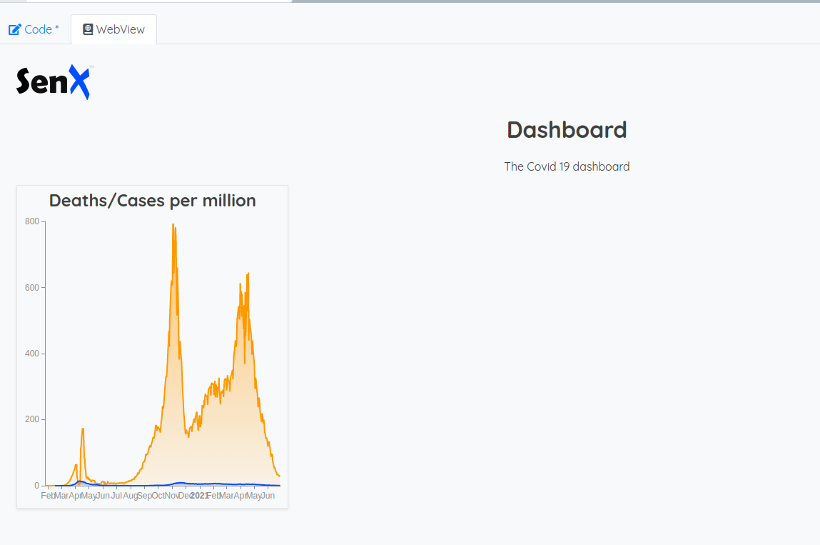
{
'title' 'Deaths/Cases per million'
'x' 0 'y' 0 'w' 3 'h' 2
'type' 'area'
'macro' <%
[ $token 'covid' { 'country' 'France' } NOW 365 d 5 * ] FETCH 'data' STORE
$data [ 8 11 ] { 8 'new_cases_per_million' 11 'new_deaths_per_million' } MVTICKSPLIT // <--- see mapping
<% ->GTS VALUELIST %> F LMAP FLATTEN 'data' STORE // extract specific fields as GTS
[ $data bucketizer.sum NOW 1 d 0 ] BUCKETIZE 'data' STORE // daily sum
[ $data mapper.mean 7 0 0 ] MAP 'data' STORE // 7 days moving average
[ $data mapper.abs 0 0 0 ] MAP 'data' STORE // there some negative values
$data
%>
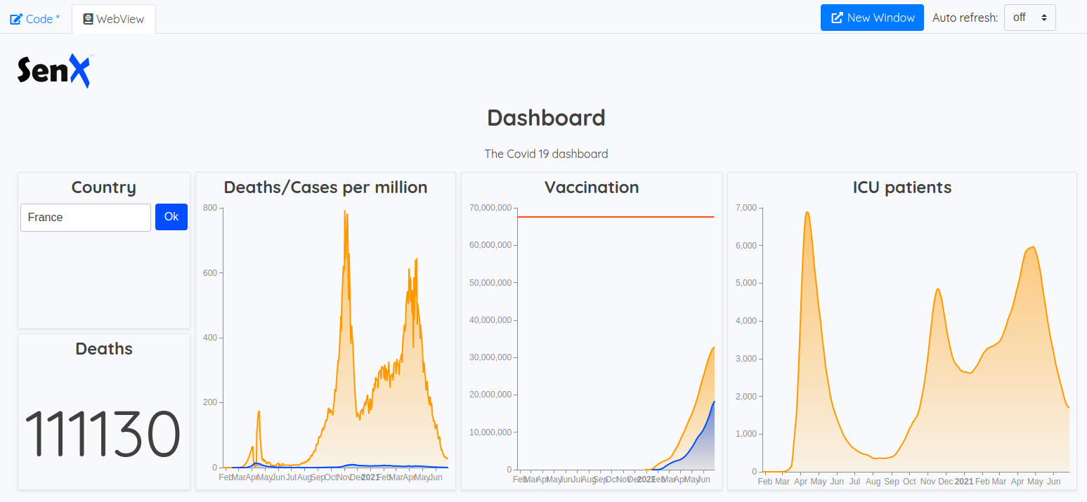
}You should have something like that:
Ok, we have curves for France, but, I would like to choose the country. In order to do so, there are special tiles: input:autocomplete and input:list
The idea is to retrieve all the values from the country label and display them in an autocomplete input. Then, we can use the event mechanism of Discovery to send the selected country to the other tile.
...  'tiles' [
    {
        'title' 'Country'
        'x' 0 'y' 0 'w' 2 'h' 1
        'type' 'input:autocomplete'
        'macro' <%
            [ $token '~.*' {} ] FINDSETS STACKTOLIST 1 GET 'country' GET LSORT 'listOfCountries' STORE
            {
                'data' $listOfCountries
                'globalParams' { 'input' { 'value' $country } } // the initial selected value coming from global vars
                'events' [ { 'type' 'variable' 'tags' [ 'country' ] 'selector' 'country' }  ] // Event definition
            }
        %>
    }
    {
        'title' 'Deaths/Cases per million'
        'x' 2 'y' 0 'w' 3 'h' 2
        'type' 'area'
        'options' { 'eventHandler' 'type=variable,tag=country' } // event handler
        'macro' <%
            [ $token 'covid'  { 'country' $country }  NOW 365 d 5 * ] FETCH
            [ 8 11 ] {  8 'new_cases_per_million' 11 'new_deaths_per_million' } MVTICKSPLIT
            <% ->GTS VALUELIST %> F LMAP FLATTEN 'data' STORE
            [ $data bucketizer.sum NOW 1 d 0 ] BUCKETIZE 'data' STORE
            [ $data mapper.mean 7 0 0 ] MAP 'data' STORE
            [ $data mapper.abs 0 0 0 ] MAP 'data' STORE
            $data
        %>
    }
]
The "Country" Tile will emit an event called "country" with the selected value. The other tile listens to events called "country" of type "variable" and re-runs the WarpScript when an event is eligible.
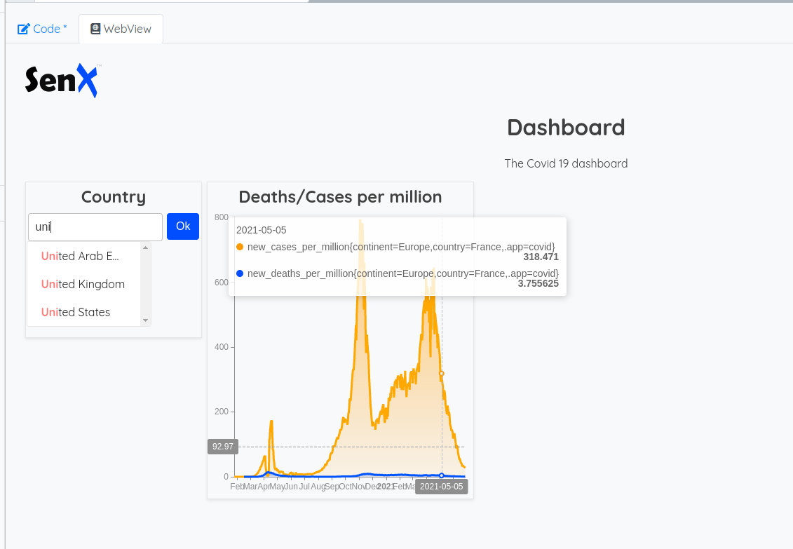
You can now select a country and by clicking on "Ok", the chart updates with this country.
Next tiles
Now it's time to add the other tiles.
The death counter
{
    'title' 'Deaths'
    'x' 0 'y' 1 'w' 2 'h' 1
    'type' 'display'
    'options' { 'eventHandler' 'type=(variable),tag=country' } // same handler
    'macro' <%
        [ $token 'covid'  { 'country' $country }  NOW -1 ] FETCH // last known value
        [ 4 ] MVTICKSPLIT 0 GET VALUES 0 GET 'v' STORE // value extraction
        { 'data' [ $v ] 'globalParams' { 'timeMode' 'custom' } } // Tile parameters,
    %>
}
The vaccination status
{
    'title' 'Vaccination'
    'x' 5 'y' 0 'w' 3 'h' 2
    'type' 'area'
    'options' { 'eventHandler' 'type=(variable),tag=country' }
    'macro' <%
        [ $token 'covid'  { 'country' $country }  NOW 365 d 5 * ] FETCH
        [ 32 33 41 ] $mapping MVTICKSPLIT // It's easier to use the mapping var
        <% ->GTS VALUELIST %> F LMAP FLATTEN 'data' STORE // we extract fields as GTS
        [ $data bucketizer.sum NOW 1 d 0 ] BUCKETIZE 'data' STORE  // daily sum
        [ $data mapper.mean 7 0 0 ] MAP 'data' STORE // 7 days moving average
        {  // custom result
            'data' $data // data to display
            'params' [ // curves customization
                { 'type' 'area' } // field 32 (people_vaccinated) as an area chart
                { 'type' 'area' } // field 33 (people_fully_vaccinated) as an area chart
                { 'type' 'line' } // field 41 (population) as a line chart
            ]
        }
    %>
}
ICU patients
{
'title' 'ICU patients'
'x' 8 'y' 0 'w' 4 'h' 2
'type' 'area'
'options' { 'eventHandler' 'type=(variable),tag=country' }
'macro' <%
[ $token 'covid' { 'country' $country } NOW 365 d 5 * ] FETCH
[ 14 ] $mapping MVTICKSPLIT
<% ->GTS VALUELIST %> F LMAP FLATTEN 'data' STORE
[ $data bucketizer.sum NOW 1 d 0 ] BUCKETIZE 'data' STORE
[ $data mapper.mean 7 0 0 ] MAP
%>
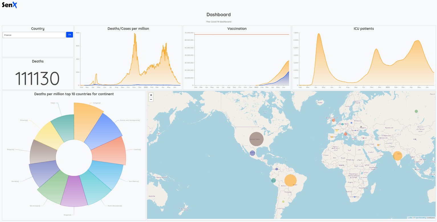
}A short break
Here is the result:
Take a step back and meditate about what we have done.
Each tile performs a fetch of 5 years history (except the death counter). Maybe we can optimize this dashboard a bit.
Tiles refactoring
The idea is to use events to pass data to tiles. The "Deaths/Cases per million" tile will perform a FETCH over 5 years of data and send it to "Vaccination" and "ICU patients" tiles.
So, we also need to do some operations before our dashboard definition.
'Your read Token' 'token' STORE // externalize some variables
'France' 'country' STORE
// Fetch 5 years of data
[ $token 'covid'  { 'country' $country }  NOW 365 d 5 * ] FETCH
// and Wrap it
WRAP 'fiveYearsOfData' STORE
{
    'title' 'Covid'
    'description' 'The Covid 19 dashboard'
    'vars' {
        'token' $token
        'country' $country
        'fiveYearsOfData' $fiveYearsOfData // a new variable
        'mapping' { ... }
    }
    'tiles' [ ... ]
}
And then, we can refactor some of our tiles. First the event emitter:
{
    'title' 'Deaths/Cases per million'
    'x' 2 'y' 0 'w' 3 'h' 2
    'type' 'area'
    'options' { 'eventHandler' 'type=variable,tag=country' } // event handler
    'macro' <%
        [ $token 'covid'  { 'country' $country }  NOW 365 d 5 * ] FETCH WRAP 'fiveYearsOfData' STORE
        // wrap result
        $fiveYearsOfData UNWRAP // unwrap it to use it
        [ 8 11 ] {  8 'new_cases_per_million' 11 'new_deaths_per_million' } MVTICKSPLIT
        <% ->GTS VALUELIST %> F LMAP FLATTEN 'data' STORE
        [ $data bucketizer.sum NOW 1 d 0 ] BUCKETIZE 'data' STORE
        [ $data mapper.mean 7 0 0 ] MAP 'data' STORE
        [ $data mapper.abs 0 0 0 ] MAP 'data' STORE
        {
            'data' $data
            'events' [ // Event definition
                { 'type' 'variable' 'tags' [ 'history' ] 'value' { 'fiveYearsOfData' $fiveYearsOfData } }   // event emitter with a new value
            ]
        }
    %>
}
And here is the data reciever:
{
    'title' 'Vaccination'
    'x' 5 'y' 0 'w' 3 'h' 2
    'type' 'area'
    'options' { 'eventHandler' 'type=variable,tag=history' } // Listen at history
    'macro' <%
        $fiveYearsOfData UNWRAP [ 32 33 41 ] $mapping MVTICKSPLIT // we have to unwrap our data
        <% ->GTS VALUELIST %> F LMAP FLATTEN 'data' STORE
        [ $data bucketizer.sum NOW 1 d 0 ] BUCKETIZE 'data' STORE
        [ $data mapper.mean 7 0 0 ] MAP 'data' STORE
        {
            'data' $data
            'params' [  { 'type' 'area' } { 'type' 'area' } { 'type' 'line' } ]
        }
    %>
}
{
    'title' 'ICU patients'
    'x' 8 'y' 0 'w' 4 'h' 2
    'type' 'area'
    'options' { 'eventHandler' 'type=variable,tag=history' }
    'macro' <%
        $fiveYearsOfData UNWRAP [ 14 ] $mapping MVTICKSPLIT // we have to unwrap our data
        <% ->GTS VALUELIST %> F LMAP FLATTEN 'data' STORE
        [ $data bucketizer.sum NOW 1 d 0 ] BUCKETIZE 'data' STORE
        [ $data mapper.mean 7 0 0 ] MAP
    %>
}
The other tiles
Deaths per million top 10 countries for continent.
When we select a country, we would like to display the top 10 countries of its continent ordered by the death count.
{
    'title' 'Deaths per million top 10 countries for continent'
    'x' 0 'y' 2 'w' 4 'h' 4
    'type' 'rose'
    'options' { 'eventHandler' 'type=variable,tag=country' }
    'macro' <%
        [ $token 'covid'  { 'country' $country } ] FINDSETS STACKTOLIST 1 GET //get labels
        'continent' GET 0 GET 'continent' STORE // get the right continent
        [ $token 'covid'  { 'continent' $continent }  NOW -1 ] FETCH [ 10 ] $mapping MVTICKSPLIT FLATTEN
        <% // for each country
            // extract the name of the country
            'g' STORE $g LABELS 'country' GET 'c' STORE
            // set it as a className and delete labels
            $g $c RENAME { NULL NULL } RELABEL
        %> F LMAP
        <% // then sort with the last value
            [ 'a' 'b' ] STORE
            <% $a VALUES 0 GET $b VALUES 0 GET > %>
            <% -1 %>
            <% 1 %> IFTE
        %> SORTWITH
        // and finally, keep only 10
        [ 0 10 ] SUBLIST
    %>
}
The deaths map
The map do not rely on the country. It could even be static by using data instead of macro.
{
    'x' 4 'y' 2 'w' 8 'h' 4
    'type' 'map'
    'data'
        [ $token 'covid'  {}  NOW -1 ] FETCH // Last known value
        // extract death count
        [ 4 ] MVTICKSPLIT <% ->GTS VALUELIST %> F LMAP FLATTEN 'gts' STORE
        // build a list of values
        $gts <% VALUES 0 GET %> F LMAP 'last' STORE
        // find the max in this list
        $last MAX 'max' STORE
        // for each country
        $gts <% DROP // drop current value
            // build custom parameters to display a weighted dot
            {
                'key' 'Total death'
                'render' 'weightedDots'
                "maxValue" $max
                "minValue" 0
            }
        %> F LMAP  'params' STORE
        { 'data' $gts 'params' $params  } // Format custom result
}
Here we are:
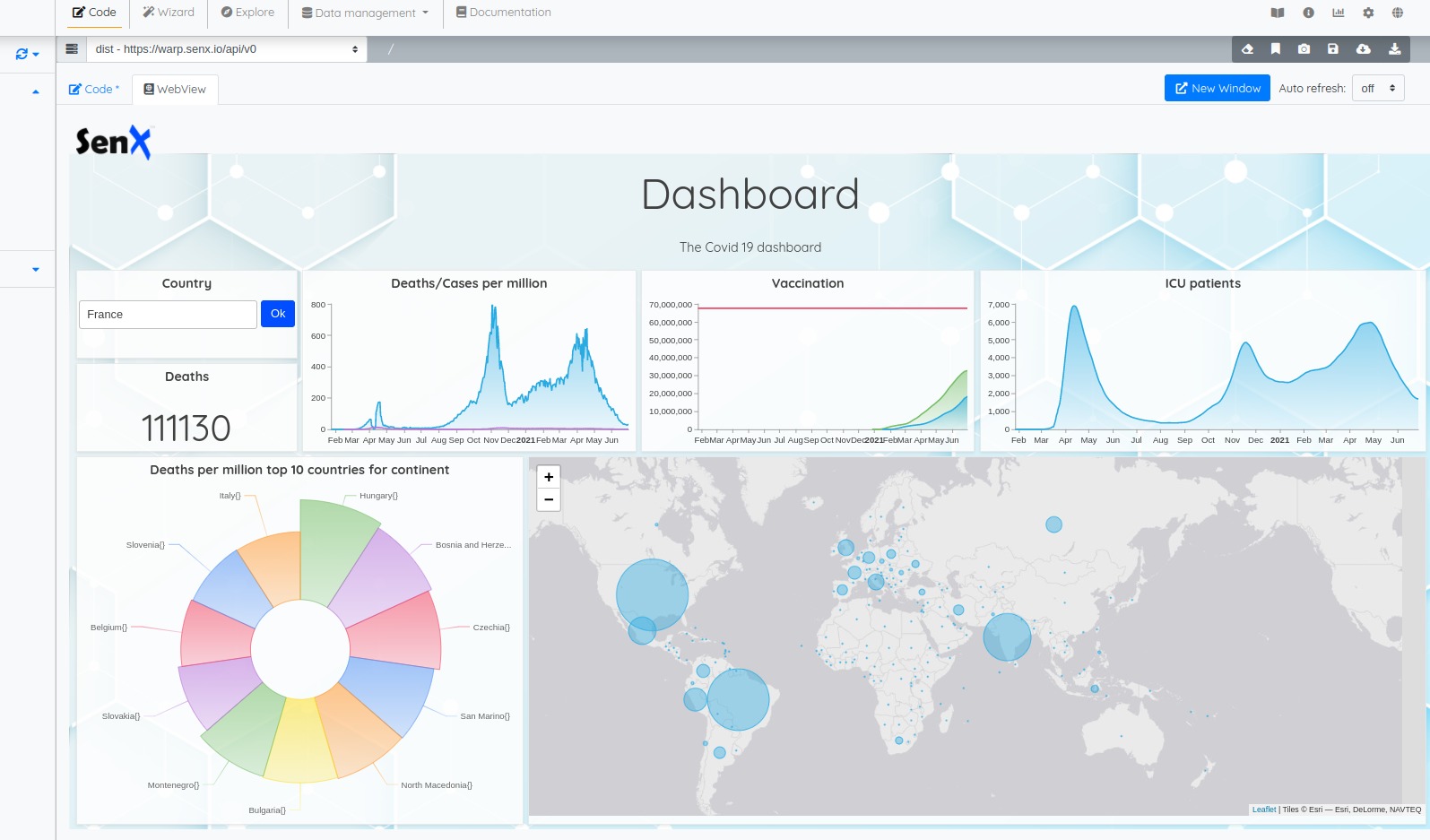
Pimp and swag
Ever wanted to put sparks in your boss eyes? (ok, sometimes I know, not sparks but fists, it's another story 😉 )
There are many ways to pimp your dashboard.
You can set the cell height (120 pixels? Ok). You can choose a chart color scheme for the entire dashboard or for a particular tile:
{
    'title' 'Covid Tracker'
    'description' 'The Covid 19 dashboard'
    'cellHeight' 120
    'options' {
        'scheme' 'CHARTANA' // choose your scheme
    }  ...
Available schemes are:
COHESIVE, COHESIVE_2, BELIZE, VIRIDIS, MAGMA, INFERNO, PLASMA, YL_OR_RD, YL_GN_BU, BU_GN, WARP10, NINETEEN_EIGHTY_FOUR, ATLANTIS, DO_ANDROIDS_DREAM, DELOREAN, CTHULHU, ECTOPLASM, T_MAX_400_FILM
You can also set custom CSS at the dashboard level or for a particular tile, with a key (CSS selector) value map:
{
    'title' 'Covid Tracker'
    'description' 'The Covid 19 dashboard'
    'cellHeight' 120
    'options' {
        'scheme' 'CHARTANA'
        'customStyles' {
            '.discovery-dashboard-main'
            <'
                margin: 0;
                font-size       : 12px;
                background-color: #FAFBFF;
                line-height     : 1.52;
                color           : #1b1b1b;
                --warp-view-font-color             : #404040;
                --warp-view-chart-label-color      : #404040;
                --gts-stack-font-color             : #404040;
                --warp-view-chart-legend-bg        : #000;
                --gts-labelvalue-font-color        : #ccc;
                --gts-separator-font-color         : #404040;
                --gts-labelname-font-color         : rgb(105, 223, 184);
                --gts-classname-font-color         : rgb(126, 189, 245);
                --warp-view-chart-legend-color     : #404040;
                --warp-view-tile-background        : rgba(254,254,254, 0.85);
                background      : url('https://blog.senx.io/wp-content/uploads/2021/06/background_templatecovid-02.png') !important;
            '>
            '.discovery-dashboard-main h1' 'font-size: 5em; font-weight: 400; margin: 0;'
            '.discovery-dashboard-main p' 'font-size: 1.5em;'
        }
    }
You can also set a particular color for a particular curve:
{
    'title' 'Deaths/Cases per million'
    'x' 2 'y' 0 'w' 3 'h' 2
    'type' 'area'
    'options' { 'eventHandler' 'type=variable,tag=country' } // event handler
    'macro' <%     ...
        {
            'data' $data
            'params' [ { 'datasetColor' '#29ABE2' } ] // Set the color
            'events' [ // Event definition
                { 'type' 'variable' 'tags' [ 'history' ] 'value' { 'fiveYearsOfData' $fiveYearsOfData } }
            ]
        }
    %>
}
Or:
{
    'title' 'Vaccination'
    'x' 5 'y' 0 'w' 3 'h' 2
    'type' 'area'
    'options' { 'eventHandler' 'type=variable,tag=history' }
    'macro' <%    ...
        {
            'data' $data
            'params' [
                { 'type' 'area' } // chose the representation
                { 'type' 'area' 'datasetColor' '#29ABE2' } // set a color
                { 'type' 'line' }
            ]
        }
    %>
}
And even add some swag to the map:
{
    'x' 4 'y' 2 'w' 8 'h' 4
    'type' 'map'
    'options'  {
        'scheme' 'CHARTANA' // pimp the color scheme for this tile
        'map'  { 'mapType' 'GRAYSCALE' }  // choose a map type
    }
    'data'
        ...
        $gts <% DROP // drop current value
        // build custom parameters to display a weighted dot
        {
            'key' 'Total death'
            'render' 'weightedDots'
            "color" "#29ABE2cc" // colors with alpha
            "borderColor" "#29ABE2"  // or full color
            "maxValue" $max
            "minValue" 0
        }
    %> F LMAP  'params' STORE
    { 'data' $gts 'params' $params  'globalParams' { "map" { "startZoom" 4 } } } // Format custom result
}
Available
mapTypeare:NONE, DEFAULT, HOT, TOPO, TOPO2, STADIA, STADIA_DARK, TONER, TONER_LITE, TERRAIN, ESRI, SATELLITE, OCEANS, GRAY, GRAYSCALE, WATERCOLOR, CARTODB, CARTODB_DARK
You can find the complete code here: https://snapshot.senx.io/0005c5fb96a870ec-0-0-7d33d9f0662dca46
Going further
Ok, your boss won't have sparkles in their eyes because this dashboard resides in WarpStudio. But what about a standalone HTML page?
Easy:
<html>

<head>
    <title>Covid Tracker</title>
    <link rel="preconnect" href="https://fonts.googleapis.com">
    <link rel="preconnect" href="https://fonts.gstatic.com" crossorigin>
    <link href="https://fonts.googleapis.com/css2?family=Quicksand:wght@300;400;500;600;700&display=swap"
        rel="stylesheet">
    <style>
        html,
        body {
            padding: 0;
            margin: 0;
            font-family: 'Quicksand', sans-serif;
        }

        discovery-dashboard {
            color: transparent;
        }
    </style>
</head>

<body>
    <discovery-dashboard url="https://sandbox.senx.io/api/v0/exec">
        // Your dashboard code here
        'Read Token' 'token' STORE
        'France' 'country' STORE[ $token 'covid' { 'country' $country } NOW 365 d 5 * ] FETCH WRAP
        'fiveYearsOfData' STORE
        {
            'title' 'Covid'
            'description' 'The Covid 19 dashboard'
            'cellHeight' 120
            'options' {
                'scheme' 'CHARTANA'
                'customStyles' {
                    '.discovery-dashboard-main'
                    <'
                        margin: 0; font-size : 12px;
                        background-color: #FAFBFF;
                        line-height : 1.52;
                        color : #1b1b1b;
                        --warp-view-font-color : #404040;
                        --warp-view-chart-label-color : #404040;
                        --gts-stack-font-color : #404040;
                        --warp-view-chart-legend-bg : #000;
                        --gts-labelvalue-font-color : #ccc;
                        --gts-separator-font-color : #404040;
                        --gts-labelname-font-color : rgb(105, 223, 184);
                        --gts-classname-font-color : rgb(126, 189, 245);
                        --warp-view-chart-legend-color : #404040;
                        --warp-view-tile-background : rgba(254,254,254, 0.85);
                        background : url('https://blog.senx.io/wp-content/uploads/2021/06/background_templatecovid-02.png') !important;
                    '>
                    '.discovery-dashboard-main h1' 'font-size: 5em; font-weight: 400; margin: 0;'
                    '.discovery-dashboard-main p' 'font-size: 1.5em;'
                }
            } 'vars' {
                'token' $token
                'country' $country
                'fiveYearsOfData' $fiveYearsOfData
                'mapping' { ... }
            } 'tiles' [ ...]
        } // no need to call a macro
    </discovery-dashboard>
            <!-- Import Discovery -->
            <script nomodule src="https://unpkg.com/@senx/discovery-widgets/dist/discovery/discovery.js"></script>
            <script type="module" src="https://unpkg.com/@senx/discovery-widgets/dist/discovery/discovery.esm.js"></script>
</body>
</html>
Here we are. I hope it will give you a will to build your own dashboards upon Warp 10 and Discovery.
More articles about Discovery:
- Server monitoring with Warp 10 and Telegraf
- Santa asset tracking and delivery service
- Using Warp 10 as a map tile server for Discovery
Full Discovery documentation is available here.
Read more
Archiving Time Series Data into Amazon S3
Discovery Tips&Tricks #5 - Points Of Interest
Forecast with Facebook Prophet and CALL

Senior Software Engineer