Building dashboards for Warp 10 with Discovery is easy. Now, serving them is too.
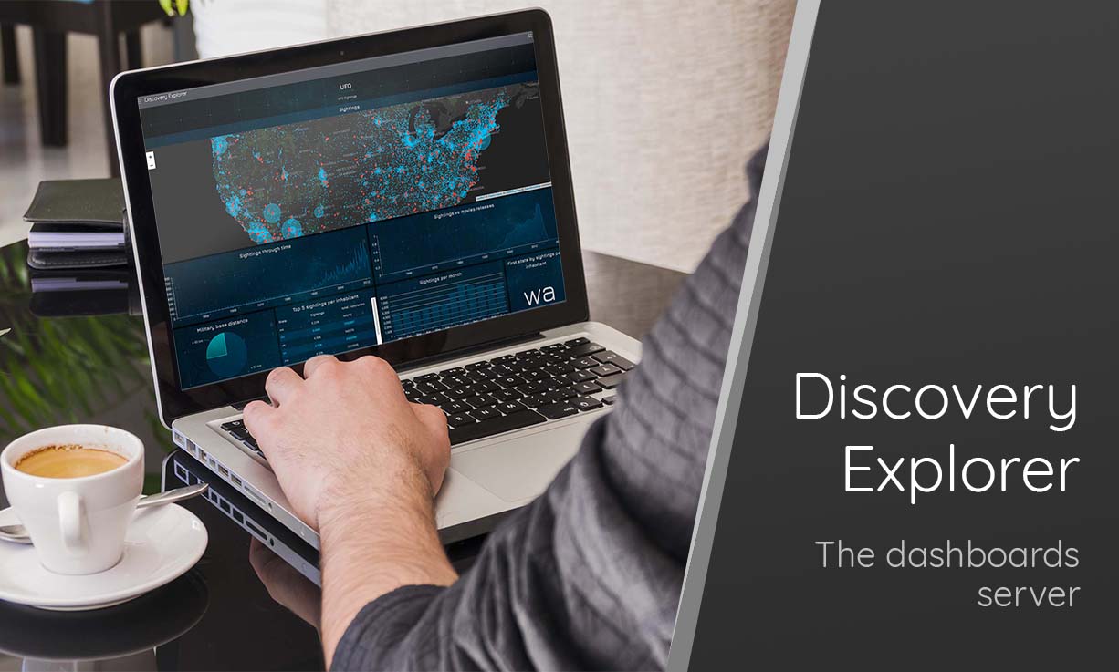
Analyzing data sometimes also means visualizing them. To do so, we developed Discovery, the dashboard as code tool. Now it is easy to develop custom dashboards upon Warp 10.
You can find some samples on the blog:
- Santa asset tracking and delivery service
- Server monitoring with Warp 10 and Telegraf
- Covid Tracker built with Warp 10 and Discovery
- W. Files Conspiracy vol. 2: Spy drones over UDP
- Build a Complete Application with Warp 10, from TCP Stream to Dashboard
- and so on.
There are many ways to benefit from Discovery:
But, today there is a new one: Discovery Explorer.
The main purpose of Discovery Explorer is to serve your dashboards easily through a Website.
Setup
Install Docker and create a directory that will contain your dashboards, i.e. /home/warp10/dashboards.
Pull and start Discovery Explorer, pointing to this directory:
docker run --rm -d -p9090:3000 \
    -v /home/warp10/dashboards:/data  \
    --name=discovery-explorer \
    warp10io/discovery-explorer:latest
Open http://localhost:9090 in your browser to see it working.
First Dashboard
Now, create a brand-new dashboard from scratch in a subdirectory: /home/warp10/dashboards/test/test.mc2
// @endpoint https://sandbox.senx.io/api/v0/exec
{
    'title' 'Test'
    'tiles' [
        {
            'type' 'display'
            'x' 0 'y' 0 'w' 12 'h' 4
            'data' 'Hello World'
        }
    ]
}
The first line is very important, it is used to set the Warp 10 instance against which your dashboard is executed. Define your Warp 10 endpoint with // @endpoint http(s)://yourwarp10/api/v0/exec.
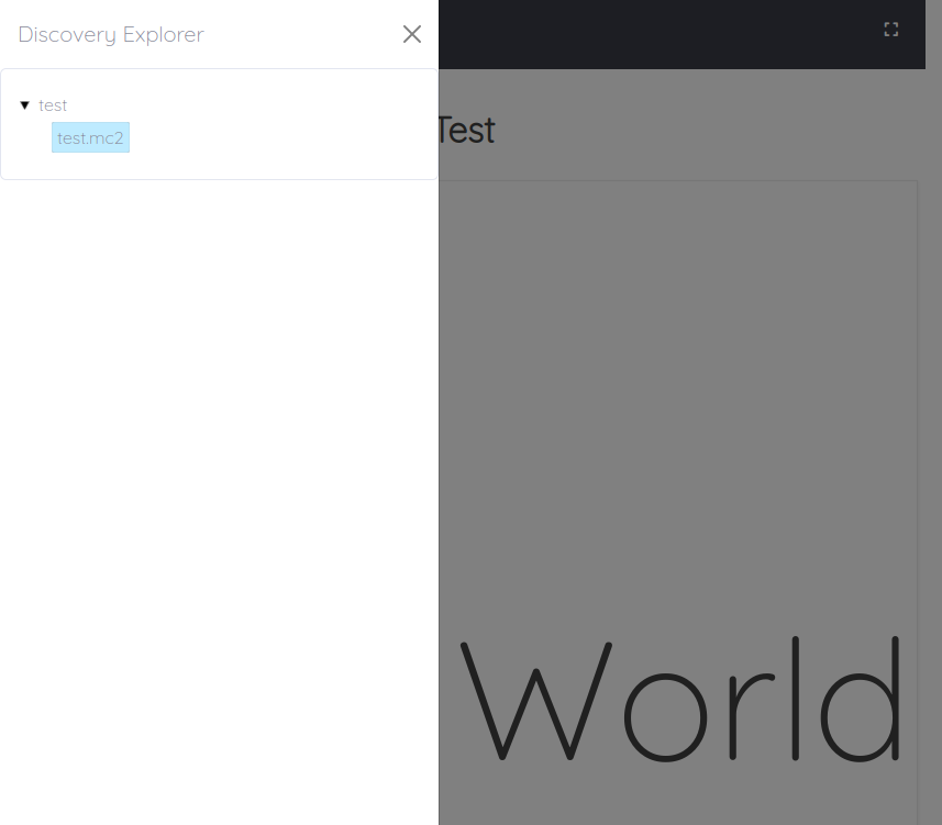
Once your mc2 is saved, you can reload Discovery and open the left menu:
As you can see, you have the file path in the URL: http://localhost:9090/%2Ftest%2Ftest.mc2 so you can share it easily.
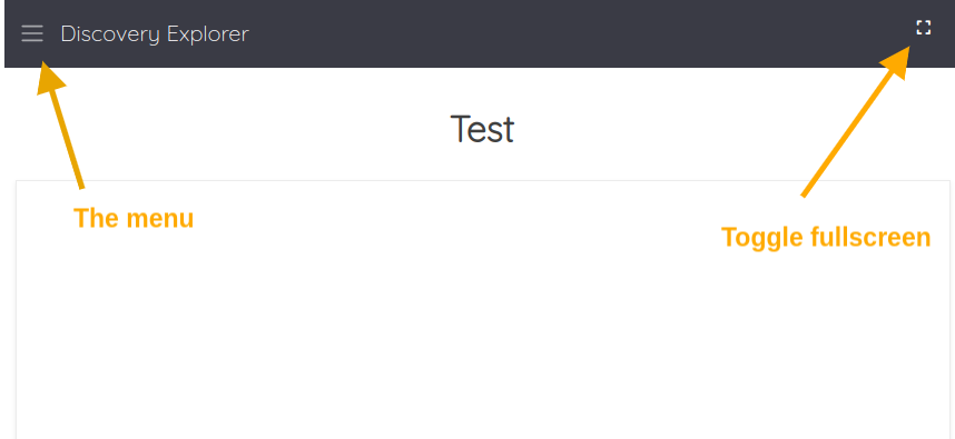
And the GUI is over-complicated:
Pimp my dashboard
As usual with Discovery, you can customize the look and feel.
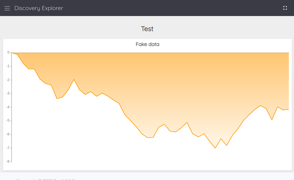
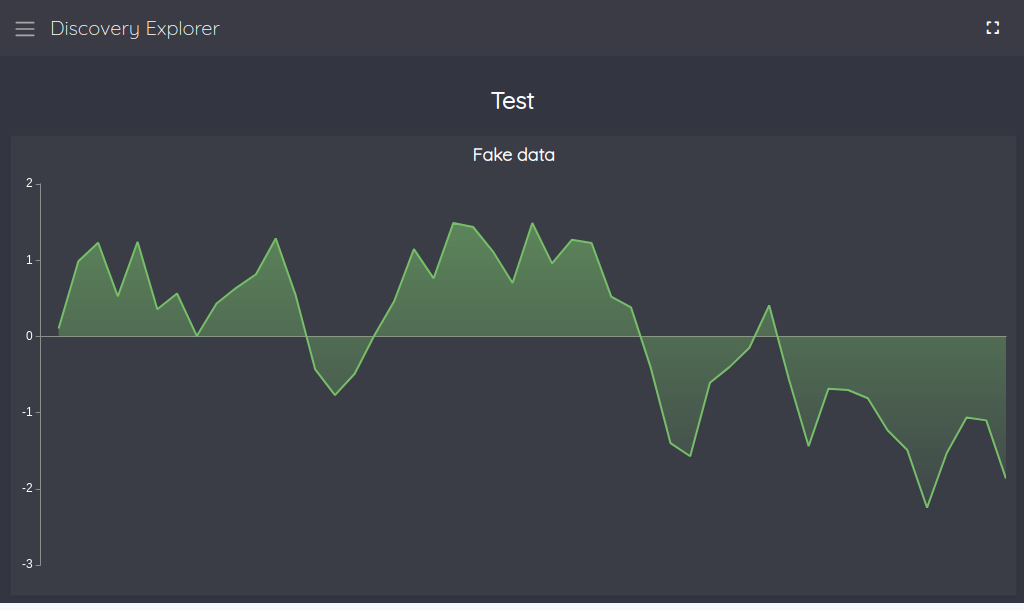
Now modify your dashboard in order to display fake data:
// @endpoint https://sandbox.senx.io/api/v0/exec
{
    'title' 'Test'
    'tiles' [
        {
            'type' 'area'
            'title' 'Fake data'
            'x' 0 'y' 0 'w' 12 'h' 2
            'macro' <% 50 @senx/rand/RANDOMWALK %>
        }
    ]
}This is the default theme. There are 2 other built-in themes, which you can specify with:
// @theme default | light | dark
// @endpoint https://sandbox.senx.io/api/v0/exec
// @theme light
{
    'title' 'Test'
    'tiles' [
        {
            'type' 'area'
            'title' 'Fake data'
            'x' 0 'y' 0 'w' 12 'h' 2
            'macro' <% 50 @senx/rand/RANDOMWALK %>
        }
    ]
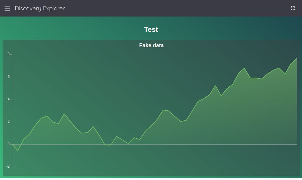
}You can also mix it with all the Discovery customization capabilities:
// @endpoint https://sandbox.senx.io/api/v0/exec
// @theme dark
{
    'title' 'Test'
    'options' { 'scheme' 'CHARTANA' }
    'tiles' [
        {
            'type' 'area'
            'title' 'Fake data'
            'x' 0 'y' 0 'w' 12 'h' 2
            'macro' <% 50 @senx/rand/RANDOMWALK %>
        }
    ]
}You can even provide your own CSS, name it as your mc2 (except the file extension) and place it against your mc2:
// @endpoint https://sandbox.senx.io/api/v0/exec
{
    'title' 'Test'
    'options' { 'scheme' 'CHARTANA' }
    'tiles' [
        {
            'type' 'area'
            'title' 'Fake data'
            'x' 0 'y' 0 'w' 12 'h' 2
            'macro' <% 50 @senx/rand/RANDOMWALK %>
        }
    ]
}
.dashboard-panel {
@import url('https://fonts.googleapis.com/css2?family=Kanit:wght@200&display=swap');
--wc-split-gutter-color : #404040;
--warp-view-pagination-bg-color : #343a40 !important;
--warp-view-pagination-border-color: #6c757d;
--warp-view-datagrid-odd-bg-color : rgba(255, 255, 255, .05);
--warp-view-datagrid-odd-color : #FFFFFF;
--warp-view-datagrid-even-bg-color : #212529;
--warp-view-datagrid-even-color : #FFFFFF;
--warp-view-font-color : #FFFFFF;
--warp-view-chart-label-color : #FFFFFF;
--gts-stack-font-color : #FFFFFF;
--warp-view-resize-handle-color : #111111;
--warp-view-chart-legend-bg : #000;
--gts-labelvalue-font-color : #ccc;
--gts-separator-font-color : #FFFFFF;
--gts-labelname-font-color : rgb(105, 223, 184);
--gts-classname-font-color : rgb(126, 189, 245);
--warp-view-chart-legend-color : #FFFFFF;
--wc-tab-header-color : #FFFFFF;
--wc-tab-header-selected-color : #404040;
--warp-view-tile-background : #40404066;
font-family: 'Kanit', sans-serif;
font-size : 12px;
line-height: 1.52;
color : #1b1b1b;
background : #FAFBFF linear-gradient(40deg, #3BBC7D, #1D434C) fixed;
padding : 1rem;
height : calc(100vh - 2rem);
}
discovery-dashboard {
color: transparent;
}Going further
You can deploy it on your infra with a handy side companion: WarpFleet Git Synchronizer.
With both of those tools, you can easily deploy and serve your dashboards.
Do not hesitate to share your Discovery art with us, we are curious about what you do with it.
Read more
Grafana BeerTender Dashboard connected with Warp 10
Saving and processing sensor data with Node-RED and WarpScript
WarpScript ❤️ Kafka Streams

Senior Software Engineer
