This blog post covers a way to design a digital twin based on real data. Learn how to display a representation of your system, add some charts to it and interact with it.

In 2021, we published the Santa asset tracking and delivery service. Now it's time to dive into his workshop and monitor it by making a digital twin dashboard.
By experience, we often encounter commercial discourses about digital twins. Many companies translate this concept with: "Hey look, we have a fancy 3D dashboard" and they omit the most important thing: data.
The best way to store, collect, and analyze a deep history of data is of course by using Warp 10 (obviously). You can easily plug the dashboard you want into it. The fancy 3D dashboard is just the part of the iceberg that shines in the sun.
But, thanks to Discovery, you can build your own fancy dashboard on top of our technologies.
| Learn more on the blog about Discovery, a dynamic dashboard tool dedicated to time series data. |
The dataset
We recently published a series of onboarding tutorials to learn how Warp 10 works and the basics of the WarpScript language. We will use its dataset.
You can follow this tutorial carefully or go a little faster (if you are a little familiar with our technologies) by following these steps:
- Go to https://sandbox.senx.io/ and generate tokens by clicking on "Enter Sandbox"
- Keep the read token in a safe place
- Go to WarpStudio by clicking on "Analyze"
- Modify the generated code to explore the default dataset
'<your read token>' 'token' STORE
[ $token '~.*' {} ] FIND
You should have a result like this:
[
    [
        {
            "c": "room.temperature.10x",
            "l": { "unit": "celsius", "serial": "48779", ".app": "sandbox.tutorial" },
            "a": {},
            "la": 1702541505741,
            "v": []
        },
        {
            "c": "outside.temperature",
            "l": { "unit": "degC", "serial": "48779", "app": "sandbox.tutorial" },
            "a": {},
            "la": 1699613806507,
            "v": []
        },
        {
            "c": "outside.temperature",
            "l": { "unit": "celsius", "serial": "48779", ".app": "sandbox.tutorial" },
            "a": {},
            "la": 1702541505741,
            "v": []
        },
        {
            "c": "sanitary.water.temperature.10x",
            "l": { "unit": "celsius", "serial": "48779", ".app": "sandbox.tutorial" },
            "a": {},
            "la": 1702541505741,
            "v": []
        },
        {
            "c": "heatpump.power",
            "l": { "unit": "W", "serial": "48779", ".app": "sandbox.tutorial" },
            "a": {},
            "la": 1702541505741,
            "v": []
        },
        {
            "c": "sanitary.water.temperature",
            "l": { "unit": "celsius", "serial": "48779", ".app": "sandbox.tutorial" },
            "a": {},
            "la": 1699613806507,
            "v": []
        },
        {
            "c": "heatpump.kwh.total",
            "l": { "unit": "kWh", "serial": "48779", ".app": "sandbox.tutorial" },
            "a": {},
            "la": 1702541505741,
            "v": []
        },
        {
            "c": "heater.setpoint.10x",
            "l": { "unit": "celsius", "serial": "48779", ".app": "sandbox.tutorial" },
            "a": {},
            "la": 1702541505741,
            "v": []
        },
        {
            "c": "ventilation.kwh.total",
            "l": { "unit": "kWh", "serial": "48779", ".app": "sandbox.tutorial" },
            "a": {},
            "la": 1702541505741,
            "v": []
        },
        {
            "c": "watermeter.pulsecount",
            "l": { "serial": "48779", ".app": "sandbox.tutorial" },
            "a": {},
            "la": 1702541505741,
            "v": []
        }
    ]
]
The dashboard skeleton
In WarpStudio, we have snippets to make your life easier. A bunch of them are related to Discovery. So, just type "dash" and select "discovery empty dashboard". Then, modify the code like this:
// @preview discovery
// @enpoint https://sandbox.senx.io/api/v0/exec
{
  'title' "Santa's Factory"
  'type' 'scada'
  'vars' {
    'token' '<your read token>'
  }
  'options' { 'showErrors' true }
  'tiles' [
    // list of tiles
  ]
}
The "scada" type allows you to place tiles with an absolute position in the canvas and a z-index. (Learn more).
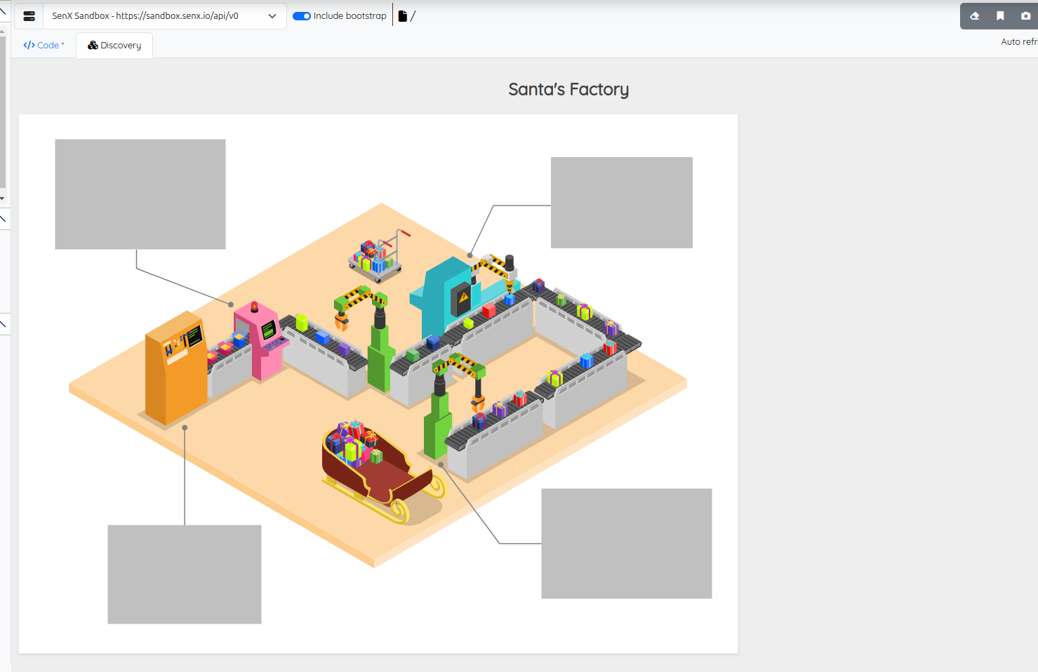
We will place some tiles on it. The first one is a "svg" tile that will cover the background. For convenience, we pack it into a macro: @senx/blog/posts/svg/santa_factory. You can find its code here.
The SVG tile
Insert a new SVG tile in the tiles array of your dashboard:
// @preview discovery
// @enpoint https://sandbox.senx.io/api/v0/exec
{
  'title' "Santa's Factory"
  'type' 'scada'
  'vars' {
    'token' '<your read token>'
  }
  'options' { 'showErrors' true }
  'tiles' [  // tiles array
    {
      'type' 'svg'
      'x' 0 'y' 0 'w' 1024 'h' 768  // the size in px of the SVG
      'macro' <% @senx/blog/posts/svg/santa_factory %>
    }
  ]
}
Execute your code and open the "Discovery" tab.
Add some tiles
The upper left tile
We will add a custom display chart that shows the last known value and a curve, with a red background.
{ // upper left tile
  'type' 'display'
  'x' 52 'y' 36 'w' 243 'h' 157 // position in px
  'options' {
    'customStyles' { // custom CSS
      '*' '--warp-view-font-size: 40px;'
    }
    'display' {
      'labelPosition' 'se'  // value position
      'chartType' 'area'
      'showChart' true
      'decimals' 2          // rounded display
    }
    'bgColor' '#F44336'
    'fontColor' '#ffffff'
    'responsive' false      // for fixed font size
    'unit' '°C'
  }
  'macro' <%
    [ $token 'sanitary.water.temperature' {} NOW -100 ] FETCH // Fetch last 100 data
  %>
}
The upper right tile
A pie tile with a blank background and custom random values, refreshed every 2 seconds.
{ // upper right tile
  'type' 'pie'
  'x' 758 'y' 61 'w' 202 'h' 130 // position in px
  'options' {
    'bgColor' '#ffffff'
    'fontColor' '#404040'
    'autoRefresh' 2
  }
  'macro' <%
    {
      'data' [
        0 2 <%
          'j' STORE
          { 'key' 'V. ' $j TOSTRING + 'value' RAND }
        %> FOR
      ]
      'params' [ { 'datasetColor' '#4CAF50' } { 'datasetColor' '#F44336' } { 'datasetColor' '#3F51B5' } ]
      'events' [] // For later use
    }
  %>
}
The lower left tile
A bar chart with a green background and white bars.
{ // lower left tile
  'type' 'bar'
  'x' 127 'y' 586 'w' 219 'h' 141 // position in px
  'options' {
    'customStyles' { // custom CSS
      '*'
      <'
        --warp-view-chart-grid-color: #ffffff;
        --warp-view-chart-label-color: #ffffff;
      '>
    }
    'bgColor' '#4CAF50'
    'fontColor' '#ffffff'
    'unit' 'W'
    'hideXAxis' true
  }
  'macro' <%
    [ $token 'heatpump.power' {} NOW -10 ] FETCH 'gts' STORE // Fetch data
    {
      'data' $gts
      'params' [ { 'datasetColor' '#ffffff' } ]
    }
  %>
}
The lower right tile
A custom display chart that shows the last known value and a curve, with a blue background.
{ // lower right tile
  'type' 'display'
  'x' 745 'y' 534 'w' 243 'h' 157 // position in px
  'options' {
    'customStyles' { // custom CSS
      '*' '--warp-view-font-size: 40px;'
    }
    'bgColor' '#2196F3'
    'fontColor' '#ffffff'
    'responsive' false      // for fixed font size
    'unit' 'Gifts'
  }
  'macro' <%
    [ $token 'watermeter.pulsecount' {} NOW -100 ] FETCH  'gts' STORE // Fetch data
    $gts false RESETS 'gts' STORE               // it is a counter
    $gts 0 GET CLONE                            // keep the gts
    -1 SHRINK VALUES 0 GET 'value' STORE        // extract the last value
    [ $gts mapper.rate  1 0 0 ] MAP 'gts' STORE // compute the rate
    {
      'data' $gts
      'globalParams' {
        'display' {
          'value' $value
          'labelPosition' 'se'  // value position
          'chartType' 'area'
          'showChart' true
          'decimals' 2          // rounded display
        }
      }
    }
  %>
}
The result
You should get this dashboard at this point:
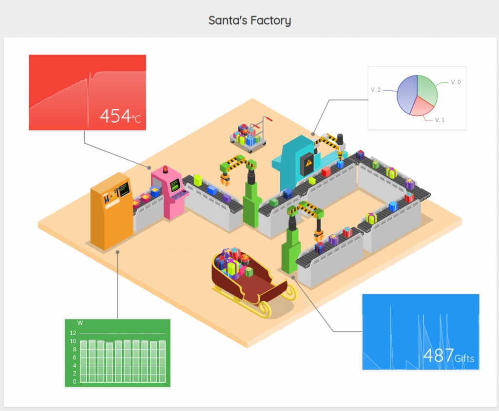
Add some sparkles
Now add some modifications. First, the global theme.
// @preview discovery
// @enpoint https://sandbox.senx.io/api/v0/exec
// There are some available themes: default, light, dark, dark-blue, chalk, fresh, green and vintage
// @theme vintage
{
  'title' "Santa's Factory"
  'type' 'scada'
[...]
Interact with the SVG
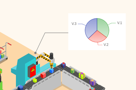
This is the most interesting part. Your tiles can modify your SVG in two ways, using the event mechanism.
The main idea is to emit an event from the upper right tile (the one with the pie) depending on the random value and trap it with the SVG tile.
You can emit many kinds of events, but in this case, we will use "style" and "xpath".
Adapt the SVG tile
To listen for events, you need to register an "eventHandler", which registers on messages of some tags for specific event types (regular expressions are supported):
{
  'type' 'svg'
  'x' 0 'y' 0 'w' 1024 'h' 768
  'options' { // this svg tile is now listening to xpath or style events
    'eventHandler' 'type=(xpath|style),tag=value[0-9]' // listen for value0 to value9 xpath or style events
  }
  'macro' <% @senx/blog/posts/svg/santa_factory %>
}
We introduced random values within the pie because the available dataset is static. So we will fire events depending on those random values. Of course, in real life, you can rely on your real-time values.
Now, we have to emit events.
Style event
We apply a CSS style to an element depending on a value. The element is selected using a CSS selector. We want to change the color of the panel behind the warning sign.

Modify the upper right tile macro to send a style event.
{ // upper right tile
  'type' 'pie'
  'x' 758 'y' 61 'w' 202 'h' 130 // position in px
  'options' {
    'bgColor' '#ffffff'
    'fontColor' '#404040'
    'autoRefresh' 2
  }
  'macro' <%
    // compute values
    RAND 'value1' STORE
    RAND 'value2' STORE
    RAND 'value3' STORE
    {
      'data' [ // custom data format
          { 'key' 'V.1' 'value' $value1 }
          { 'key' 'V.2' 'value' $value2 }
          { 'key' 'V.3' 'value' $value3 }
      ]
      // pie colors
      'params' [ { 'datasetColor' '#4CAF50' } { 'datasetColor' '#F44336' } { 'datasetColor' '#3F51B5' } ]
      'events' [
        {  // emit a "style" event on the "value1" channel
          'tags' [ 'value1' ]
          'type' 'style'
          'value' {
            // CSS selector
            '#Layer_1 > g:nth-child(9) > g:nth-child(8) > polygon.st83'
            <% $value1 0.5 > %>             // if > 0.5
            <% 'fill: red !important;' %>   // Then
            <% 'fill: green !important;' %> // else
            IFTE                            // IF Then Else
          }
        }
      ]
    }
  %>
}
Of course, you can add as many events or styles as you want to modify the SVG elements of your choice.
XPath event
Instead of a CSS selector, you can use an XPath selector. We will move the robot arm depending on a value:

Modify upper right tile pie tile to send another event:
{ // upper right tile
'type' 'pie'
'x' 758 'y' 61 'w' 202 'h' 130 // position in px
'options' {
'bgColor' '#ffffff'
'fontColor' '#404040'
'autoRefresh' 2
}
'macro' <%
RAND 'value1' STORE
RAND 'value2' STORE
RAND 'value3' STORE
{
'data' [
{ 'key' 'V.1' 'value' $value1 }
{ 'key' 'V.2' 'value' $value2 }
{ 'key' 'V.3' 'value' $value3 }
]
'params' [ { 'datasetColor' '#4CAF50' } { 'datasetColor' '#F44336' } { 'datasetColor' '#3F51B5' } ]
'events' [
{
'tags' [ 'value1' ]
'type' 'style'
'value' {
'#Layer_1 > g:nth-child(9) > g:nth-child(8) > polygon.st83'
<% $value1 0.5 > %> <% 'fill: red !important;' %> <% 'fill: green !important;' %> IFTE
}
}
{
'tags' [ 'value2' ]
'type' 'xpath'
'selector' '//*[@id="Layer_1"]/g[7]/g[6]' // XPath selector
// add a style attribute which rely upon a value
'value' { 'style' 'transform: translate(0px,' $value2 -20.0 * TOSTRING + 'px);' + }
}
]
}
%>
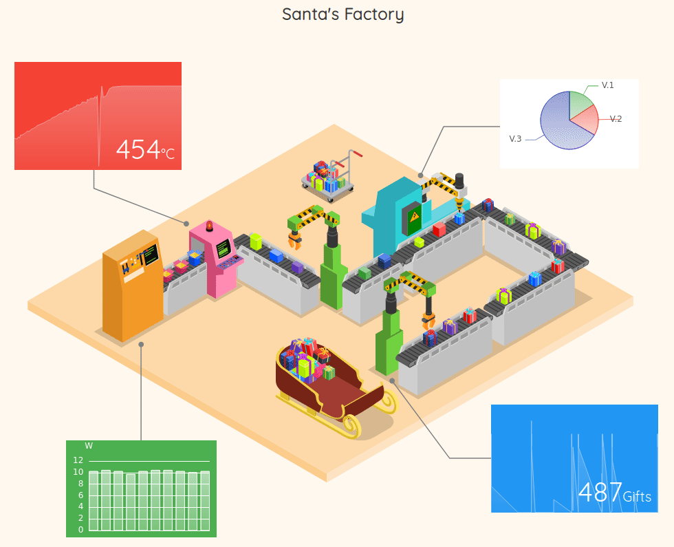
}Final result of our dashboard
If everything goes well, you should get this dashboard.
You can find the final code here.
Final thoughts
Ok, this is just a simple digital twin inspired by the season. Depending on your business, you can adapt this technique to build a more complex dashboard. You do not need a third-party tool to do that (except an SVG editor), you can build your own digital twin with Warp 10 and Discovery.
If you want to publish your dashboard in your company, take a look at Discovery-Explorer and WarpFleetSync.
Let us know what you have built as a dashboard, we are always well surprised by what you have built. And feel free to contact us to discuss your needs.
Merry Christmas to you all! 𝐇𝗼 𝐇𝗼 𝐇𝗼!
Read more
2022 review of the Warp 10 platform
2021 recap: new functions and tools in the Warp 10 Platform
WarpStudio v2: What's new in our Web IDE?

Senior Software Engineer