Go beyond the limits of javascript chart and dataviz librairies. Drawing server side can easily be done in WarpScript in your Warp 10 database.
Data analysis often has two kinds of results:
- Machine to machine result. Your output is being parsed by another system. No need for drawing here.
- Visualization. A human being will interpret a graphical result.
For visualization, you will output a JSON, which will be parsed and processed by your favorite chart/graph library, sometimes embedded in advanced dataviz solution, such as Grafana, Kibana, Jupyter, Zeppelin…
Sounds good. The limit of this approach is the number of data point. As long as you remain reasonable, your browser will handle the load of parsing a 100k of data point to plot lines + axis + …
| Discover WarpView, a collection of charting web components dedicated to Warp 10 |
Increasing the number of data points to visualize lead to a few problems:
- Bandwidth problem : 1 million of DOUBLES produce a 12 MB JSON. Even using GZIP compression (default in Warp 10), you still have a 1 MB file to transfer.
- Browser performance problem: handling such a JSON is not easy for graph libraries
- Approximation problem: even a high-end UHD screen is only 3840 pixels wide. And graphic libraries can sometimes have a weird behavior.
Display in your favorite display library can quickly lead to:

Value=f(time)
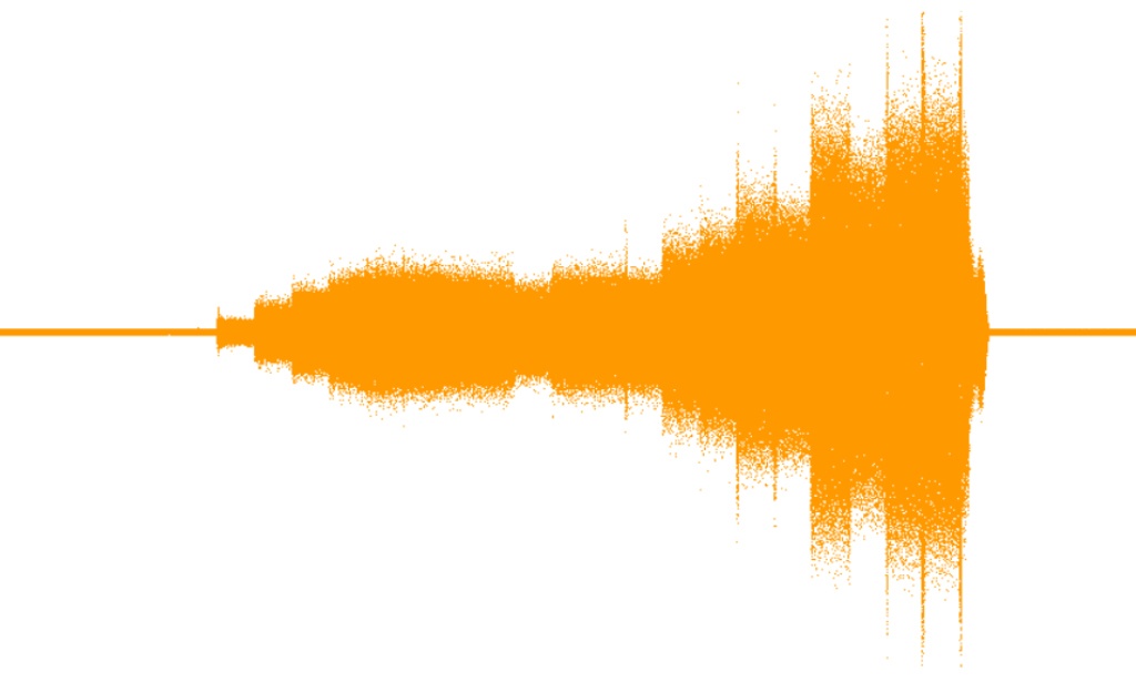
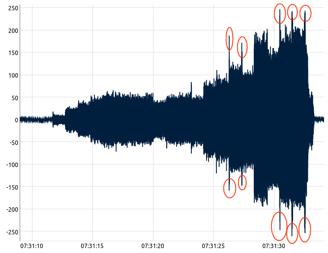
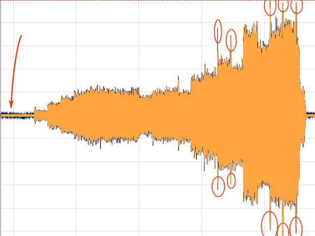
The examples and figures below are based on an acceleration sensor time series. This acquisition is done at 50kHz and has 1'250'000 data points. Fetching data from a local Warp 10 instance take 1.7s, but plotting this acquisition in Visual Studio Code (or any browser) is very painful. After 20s of patience, I have this image:
Subsampling
If I resize the window, interface freeze again during 20s. I need to do analytics to focus only on the red circles on the image above, so I need to be able to see or compare them at each step of my analysis. In the Warp 10 toolbox, I can use BUCKETIZE to subsample, but Shannon quickly catch on me:
LTTB
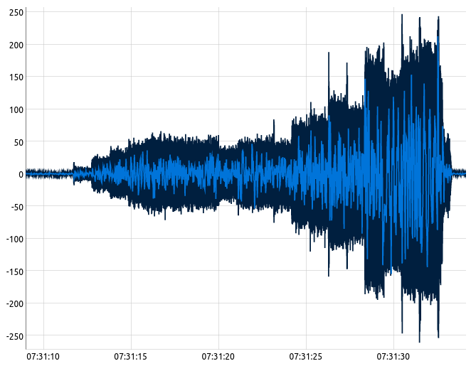
Also, often used in the Warp 10 toolbox, I can use LTTB with 1000 points. This algorithm intelligently keeps points that keep the global shape. It is very efficient to keep the anomaly or extrema. But again, there could be some surprise with a high frequency signal such as this one:
$rawdata 1000 LTTB in light blueDrawing server side
Simple plotting
WarpScript also includes a big subset of the Processing drawing library. It means you can draw an image in a WarpScript. I will try a very simple approach: plot a 1 pixel dot for every data point. Without any kind of optimization, I build a macro to NORMALIZE the curve, then plot it with the Ppoint function:
Click to see the WarpScript
<%
  //save stack context
  SAVE 'context' STORE

  'gts' STORE
  $gts NORMALIZE 'normalizedgts' STORE

  //store the first and last tick
  $gts LASTTICK 'stopTS' STORE
  $gts FIRSTTICK 'startTS' STORE

  //compute the scale by pixel
  $width TODOUBLE  $stopTS $startTS - / 'xscale' STORE
  $height TODOUBLE 'yscale' STORE


  $width $height '2D' PGraphics //create an image object
  1.01 PstrokeWeight
  0xffff9900 Pstroke //orange, 100% opacity
  255 Pbackground //white background

  //store the raw list of ticks and values
  $normalizedgts TICKLIST 'ticks' STORE
  $normalizedgts VALUES 'values' STORE
  0 $normalizedgts SIZE 1 -
  <%
    'i' STORE //store the for loop index
    $ticks $i GET $startTS - $xscale * //x
    $height $values $i GET $yscale *  - //y
    Ppoint
  %> FOR  Pencode //push a base64 encoded png on the stack

  //restore context
  $context RESTORE
%> 'drawplotgraph' STORE
Then I execute this macro on the same time series: In the Warp 10 JSON output, I have a nice string with a base64 encoded PNG image. Images on the stack are detected by VSCode WarpScript extension. Images are displayed in the VSCode "Images" tab.
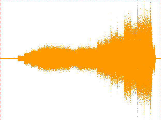
Execution time is around 5s, and the result is really lightweight: only 14 kB. For information, execution time of NORMALIZE takes around 100ms. The resulting image won't freeze my IDE or my browser. But it is less readable.
Connect points
How about drawing lines between each point? The CPU cost of drawing a line is higher than a simple one pixel dot. Code is a bit more complex, I keep the previous point on the stack and I use the Pline function.
Click to see the WarpScript
<%
  SAVE 'context' STORE // save stack context

  'gts' STORE
  $gts NORMALIZE
  //[ SWAP bucketizer.last 0 0 1000 ] BUCKETIZE 0 GET
  'normalizedgts' STORE

  $gts LASTTICK 'stopTS' STORE
  $gts FIRSTTICK 'startTS' STORE

  $width TODOUBLE $stopTS $startTS -  / 'xscale' STORE
  $height TODOUBLE 'yscale' STORE
  $normalizedgts TICKLIST 'ticks' STORE
  $normalizedgts VALUES 'values' STORE

  //first point coordinates left on the stack
  $ticks 0 GET $startTS - $xscale *  $height  $values 0 GET  $yscale *  -

  $width $height '2D' PGraphics //create an image object
  1.01 PstrokeWeight
  0xff004EFF Pstroke //blue, 100% opacity
  255 Pbackground    //stack = pgrahics on top, previous y, previous x

  0 $normalizedgts SIZE 1 -
  <%
    'i' STORE
    $ticks $i GET
    $startTS -  $xscale *  DUP 5 ROLLD
    $height  $values $i GET  $yscale *  - DUP 6 ROLLD
    5 ROLL 5 ROLL  //using stack instead of variables for performances.
    Pline
  %> FOR
  Pencode //push a base64 encoded png on the stack
  3 ROLLD DROP DROP //remove previous x y of the stack

  $context RESTORE //restore context
%> 'drawlinegraph' STORE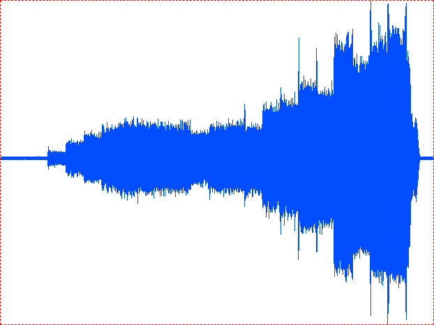
Image generation is done in 6.5s.
| Discover how to connect Tableau and Warp 10 |
Compare results !
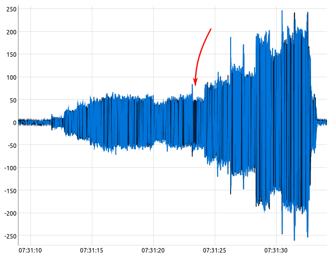
If I overlay the very first image with the one generated, both matches, but I also see the JS lib introduces some useless noise when the signal is near zero:
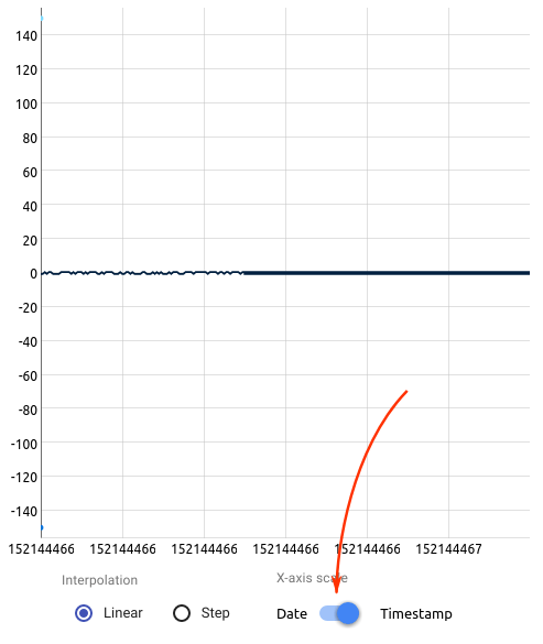
Why is there so much noise in the first seconds? Because the dygraphs JS lib has a limit at high frequency. In the following WarpScript, I generate a GTS in two steps: a low frequency, and a high frequency. Amplitude is the same, +/-0.5.
Click to see the WarpScript
NOW 'startTS' STORE

NEWGTS 'bmax' RENAME
$startTS NaN NaN NaN 150.0 ADDVALUE

NEWGTS 'bmin' RENAME
$startTS NaN NaN NaN -150.0 ADDVALUE

NEWGTS 'testGTS' RENAME

$startTS //initial
$startTS 0.5 s + //final
<% 5 ms + %> //step
<%
  NaN NaN NaN <% RAND 0.5 < %> <% -0.5 %> <% 0.5 %> IFTE  ADDVALUE
%>
FORSTEP

$startTS 0.5 s + //initial
$startTS 1.2 s + //final
<% 10 us + %> //step
<%
  NaN NaN NaN <% RAND 0.5 < %> <% -0.5 %> <% 0.5 %> IFTE  ADDVALUE
%>
FORSTEP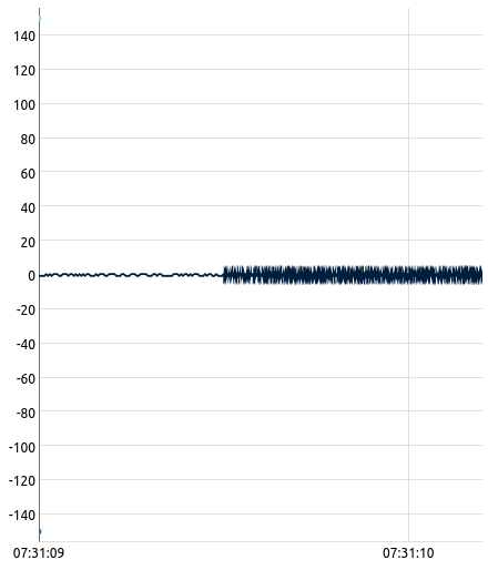
To avoid this bug, Warp 10 visualization component has a "date/timestamp" button. Switching to timestamp mode avoid this issue. Switching to steps also avoids the issue but has a cost: the lib must draw one extra line per data point.
Part 1 conclusion
- Drawing server side is a solution to visualize high frequency time series. Server rendering is faster than JS graphic libraries.
- Warp 10 Processing functions provide you all the tooling to create nice images. From basic lines to Bézier curves, with or without anti-aliasing.
- Do not blindly trust your favorite graphic library !
Read more
Grafana BeerTender Dashboard connected with Warp 10
High Performance Sailing Monitoring for the Vendée Globe
Analyze your electrical consumption from your Linky and Warp 10

Electronics engineer, fond of computer science, embedded solution developer.